Case Study

Shannon Scott Design

Creativity Without Structure

Batliboi Studio embodies bold, colorful, and imaginative thinking.

Their work feels luxurious and expressive.

The hero lacked clarity. There was no clear definition of who they are or what they specialize in. Playful GIFs added personality, yet the low-resolution logo and weak hierarchy reduced perceived quality.

scroll to read
Expressive work. Disjointed presentation.

The result was visually interesting, but unclear and under-positioned.
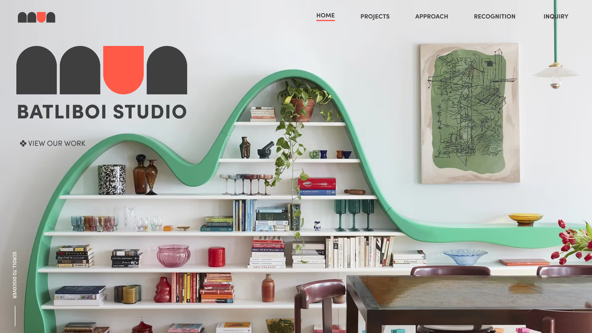
This redesign reimagines the site as a refined digital expression of their luxurious creativity. Structured, confident, and intentional.

 Expressive, Guided, Intentional

The new hero clearly introduces the studio and the type of clients they serve.

The tone filters immediately. Sophisticated, design-aware, and intentional.

The homepage is rebuilt as a guided narrative:
Work → Process → People → Invitation

Imagery is given space and light.
Hierarchy introduces rhythm.
Sections build curiosity rather than compete for attention.

HomePage

Modern interior with a green wave-shaped bookshelf filled with books and decorative items, a brown wooden table with chairs, a hanging white light, and abstract wall art.Text stating 'We design beautiful, light-filled, functional homes in NYC' and 'For those who value sophistication and craft with intention' on a beige background.Modern townhouse interior in Brooklyn, NY, featuring wood paneling, large windows, and minimalistic light fixtures.Modern townhouse kitchen with wooden cabinetry, central island, and large open window overlooking greenery.Interior with a decorative wooden fireplace mantel, a mounted flat-screen TV on an exposed brick wall, framed artwork, a chair, and modern lighting.Four panels showcasing services: architecture with a gallery, renovation with a cozy sofa, interior space planning with a modern kitchen, and a text panel inviting collaboration.Text block with 'Where bold ideas take shape' and a message about projects beginning with dialogue, inviting users to view a project gallery, featuring a simple abstract red and beige geometric logo.Black background with text inviting to build something original and view project gallery above Batliboi Studio logo.

From gallery to narrative.

old structure
Was missing the creativity and sophistication the Studio carries with every project.
re-designed
Architecture’s vibrancy translated digitally.

re-design

Modern interior with a green wave-shaped bookshelf filled with books and decorative items, a brown wooden table with chairs, a hanging white light, and abstract wall art.

Brand Aligned

Modern interior with a wavy green bookshelf filled with books, glasses, and decorative items, a wooden table with chairs, wall art, and a hanging lamp.

The redesign transforms Batliboi Studio’s site into a cohesive brand platform.

Color, hierarchy, and structure now match the energy of their architecture.

Creativity feels elevated rather than scattered.

The experience reads as memorable, expressive, and premium. Attracting clients who appreciate bold design with intention.

Through this project, I explored how expressive brands still require disciplined structure.

explore the original
website
view batliboi sutudios
Next, I continue exploring how structured storytelling adapts across different creative voices.